
Minimalist Black and White Wall Art: Choosing and Styling
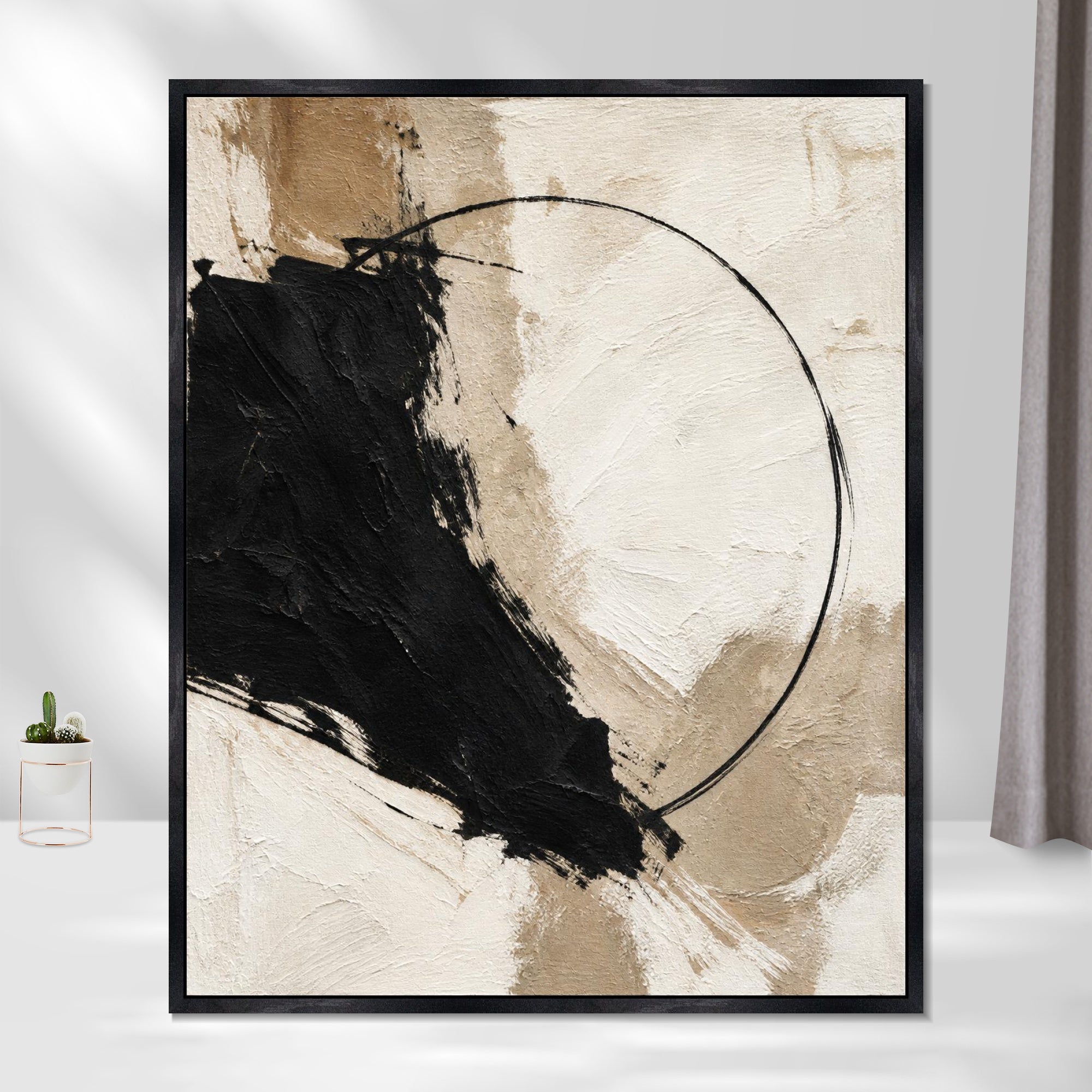
A room with one well-placed black and white print often looks more finished than a room with five scattered color pieces. That's the quiet appeal of monochrome wall art: it doesn't compete with your furniture, your rug, or the view out the window. It just gives the eye somewhere calm to land.
The right minimalist black and white wall art for most homes is a single large-format piece with high contrast and generous negative space, sized to roughly two-thirds the width of the furniture below it. That one rule solves more decorating headaches than any amount of browsing. But the details, which style, what material, how many pieces, how it reads against your wall color, decide whether the result feels curated or just sparse.
This is where a lot of monochrome decorating goes wrong. People buy art that looks striking on a screen and then hang it too small, too high, or too starkly against a white wall, and the room ends up feeling cold instead of composed. Getting the style, scale, and framing right turns that same piece into something that actually warms the space up.
Which Art Style Fits Your Space?
Black and white minimalist art isn't one look. It spans crisp line drawings, soft abstract washes, and high-contrast photography, and each reads differently depending on your room's existing lines and light. Black and white art in general works because it lets form and composition carry the room without competing with color, a point echoed in this breakdown of black and white art styles and how to use them at home. Minimalist design specifically favors reductive compositions: single-line drawings, geometric forms, and photography with strong negative space, as outlined in this collection of black and white minimalist canvas prints.
Line Drawings and Geometric Shapes
Line drawings suit rooms with clean architecture, think Scandinavian furniture, matte black fixtures, or a home office with sharp angles. A single continuous line or a cluster of geometric shapes adds structure without adding visual noise. These pieces work especially well in smaller rooms because they read as light and airy rather than dense.
Abstract Forms and Negative Space
Abstract black and white pieces lean on contrast and empty space rather than recognizable shapes. A canvas that's eighty percent white with one bold black gesture can anchor a room the way a sculpture would. This style forgives imperfect symmetry in a room better than a tightly composed line drawing does.
Minimalist Photography and Landscapes
Black and white photography, especially architectural shots or stripped-back landscapes, brings depth through tonal range instead of color. A foggy treeline or a close crop of a building facade adds atmosphere without introducing a new palette to coordinate around.
How Do You Choose the Right Size and Arrangement?
Pick one large statement piece when you want calm and visual rest, and choose a gallery wall when you want texture and storytelling across a bigger surface. Both approaches work in minimalist homes; the decision comes down to the wall's proportions and how much visual activity the room can absorb.
One Statement Piece vs. a Gallery Wall
A single oversized print simplifies a room instantly and suits minimalist interiors that already have clean lines elsewhere. A gallery wall, by contrast, lets you mix photography, line work, and abstract pieces while the shared black and white palette keeps the grouping cohesive, a dynamic covered in this guide to styling black and white wall art in a living room. If you choose a gallery wall, keep frames consistent and space pieces two to three inches apart for a grouping that reads as one composition rather than a scattered collection.
Proportions Above Furniture
Art hung above a sofa, console, or bed should span roughly two-thirds the width of that furniture piece. Too narrow and it looks like an afterthought; too wide and it overwhelms the arrangement. Centering the piece around 57 to 60 inches from the floor keeps it at a natural eye level across most rooms, a benchmark referenced in this design guidance on black and white wall art placement.
Spacing for Small Walls and Narrow Areas
Narrow hallways and small apartment walls benefit from vertical orientation or a tight vertical stack of two or three smaller prints rather than one wide piece. Leave at least a few inches of breathing room between the art and any adjacent furniture or doorway trim so the piece doesn't feel crowded into the corner.
Which Print Material and Frame Should You Choose?
Canvas gives black and white art a soft, matte depth, while paper prints under glass deliver sharper detail and deeper blacks. Neither is objectively better; the choice depends on the room's lighting and how much contrast you want the piece to carry.
Canvas vs. Paper Prints
Black and white canvas prints have a tactile, gallery-like quality and handle glare well in bright rooms since there's no glass surface to catch reflections. Fine art paper, especially when framed behind glass, tends to render deeper blacks and crisper fine lines, which matters for high-contrast photography or detailed line work, a distinction laid out in this comparison of print mediums for artwork. If your room gets strong afternoon light, canvas is the more forgiving choice.
Frame Color and Finish
Black frames sharpen the contrast of monochrome art and read as more graphic; white or natural wood frames soften the look and blend into a lighter room. Matching frame finishes across multiple pieces, even if the art styles vary, keeps a grouping looking intentional rather than mismatched, an approach detailed in this guide to framing black and white art. A two to three inch white mat also gives each print room to breathe, especially in a gallery arrangement.
Texture, Glare, and Surface Detail
Glossy finishes can throw reflections under overhead lighting, which is worth testing before committing to a large statement piece near a window. Matte canvas or non-glare glass keeps the tonal range visible from any angle in the room, which matters more for art that's meant to be the focal point of a seating area.
Where Does Monochrome Art Work Best?
Black and white wall art works in nearly every room, but the style and scale you choose should shift with the room's function. A bold abstract piece that energizes a living room might feel too stark in a bathroom, where softer tonal work reads better.
Living Rooms and Bedrooms
Living rooms handle large-scale statement pieces well, especially above a sofa or media console, since there's enough furniture and texture in the room to balance the contrast. Bedrooms benefit from softer, lower-contrast black and white pieces, landscapes or abstract washes rather than bold graphic lines, since the room's purpose is rest rather than visual energy.
Entryways, Hallways, and Home Offices
Entryways and hallways suit tighter, more graphic pieces since they're viewed in passing rather than from a seated distance. A home office can handle sharper line work or geometric art, which tends to feel energizing without becoming distracting during long stretches of focus.
Kitchens and Bathrooms
Kitchens and bathrooms call for smaller-format prints that tolerate humidity and limited wall space, often black and white botanical line drawings or simple geometric shapes. Framed pieces with sealed glass hold up better than raw canvas in rooms prone to moisture.
How Can You Keep the Look Balanced?
Pair monochrome art with a wall color and texture mix that keeps the room from feeling flat. White wall art tends to recede into light-colored walls, so contrast against the wall itself often matters as much as contrast within the artwork.
Pairing Art with White or Dark Walls
Against a white wall, choose art with strong black elements so the piece doesn't wash out. Against a dark or charcoal wall, lighter, high-key minimalist wall art with lots of white space creates the opposite effect, standing out as a bright focal point rather than disappearing into the background.
Mixing Organic and Geometric Pieces
A room full of only sharp geometric lines can feel clinical. Pairing one geometric piece with an organic abstract form, a loose brushstroke or an irregular shape, keeps a grouping from feeling too rigid or repetitive.
Adding Warmth with Wood, Textiles, and Color
Monochrome art reads as warm or cold depending on what surrounds it. A wood frame, a wool throw, or a single terracotta vase nearby keeps an all black and white room from feeling sterile. Even one small accent color in a cushion or lamp base gives the eye a break from the monochrome palette without undercutting the art itself.
Choose Art That Gives the Room Breathing Space
The strongest black and white rooms share one trait: restraint. One well-scaled piece, framed to suit the room's light, usually does more for a space than a wall crowded with smaller prints.
Start with the room's function, pick a style that matches its energy, and size the art to the furniture beneath it. Canvas or paper, black frame or white, the material choice should follow the room's lighting rather than a fixed rule. Keep a little visual quiet around the piece, on the wall and in the furnishings nearby, and the art will do the work a busier room full of color never quite manages.